Free Photography Lesson: Reading Your Histogram
It’s important to understand the histogram. In this tutorial we make the histogram very easy to understand.
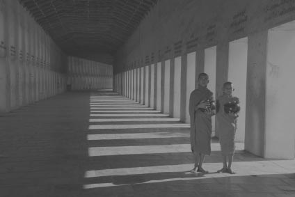
Example 1
 Photoshop Histograms and How To Read Them” width=”252″ height=”176″ />
Example 2


Looking at the levels box below you’ll see how the levels are measured for each photograph. To the left hand side is the measurement of dark tones and the right hand side is the measurement of light tones. In the middle are the mid-tones.
What you’ll also notice is the different heights of the bars in each of the sections. What this represents is the number of pixels of each tone. Looking at the levels box above we can see that there are two main peeks. The one closest to the left tells as that there are a considerable amount of relatively dark tones (you can see these dark tones in the ceiling of the hallway), while the peak to the right tells us that there are also a relatively high number of light tones (the light coming in from outside hitting the pillars and ground. The bars in the middle represent the fewer mid-tones that exist in the walls or in the uniforms of the boys.
Therefore it’s also possible to have good tonal range (dark darks, and light lights) but lack tonal balance which is simply an even representation of all tones of a photograph. While attaining a broad tonal range in a photograph is desirable to help add a dramatic effect, a balanced tonal range is very rarely possible, and will probably not enhance the beauty of your black and white photography. Look at the following photograph for example. It has great tonal range, but is very lopsided in terms of tonal balance.
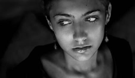

Notice how in this example, the shadows (dark tones) dominate the picture. However there is still great tonal range in this photograph. The whites of the models eyes, the shine on her lips, the white complexion in here cheeks all add to a tonal range which is desirable in black and white photography. As for mid-tones, they do exist, but as you can see they are not represented as heavily as the blacks are. The background and the girls clothing add to the dominance of black within this black and white photograph. This photograph goes to show that while tonal range is desirable, tonal balance isn’t necessary.
Notice in the next picture, the levels are read differently. Notice how the dominating light tones cause the levels graph to raise on the right hand side, while there are relatively few mid tones or dark tones compared to the large amount of white in this photograph. Again, the photograph has great tonal range but is tonally unbalanced.


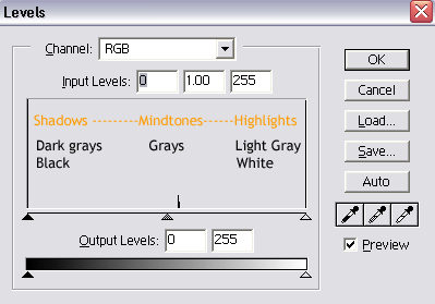
If you have photo editing software (such as adobe Photoshop) you can adjust each of these tones independently of each other. There are two sets of bars here. The bar on the furthest bottom part adjusts the photos contrast levels, while the bar above that (with the three little triangles) adjusts the tonal range. The black triangle to the left is responsible for adjusting the darkest tones, the grey triangle in the middle is responsible for adjusting mid tones and the white triangle to the right side is responsible for adjusting the light tones.
Some cameras even have built in levels monitoring programs that allow you to see the tonal range of your photograph before you take a picture. If you see that bars clumped together in the middle, you’ll probably find that your black and white photograph will lack tonal range. What you are looking for with black and white photography is great tonal range.
Here are some videos from Matt Granger on this subject:
https://www.youtube.com/watch?v=q3nmWD_Ld8s
Here is a video from VistaClues on this subject:
Here is a video from Karl Taylor on this subject:
Here is a video on modifying photos using the histogram in Adobe Lightroom:
If you want to learn photography sign up here for an online photography course and join us in the online student workspace.
Test Your Knowledge
Ready to test what you’ve learned? Try these related quizzes: