Black and white photography strips away the distraction of color to reveal the essential elements of an image: light, shadow, form, texture, and composition. It is one of the oldest forms of photographic expression, predating color photography by nearly a century, and it remains a powerful artistic choice in the digital age. Understanding when and why to work in black and white, and how to do it effectively, adds an important dimension to your creative range.
A Brief History
Photography was born in black and white. From the earliest daguerreotypes of the 1830s through the mid-twentieth century, monochrome was not a creative choice but a technological limitation. Photographers worked within this constraint and developed a rich visual language of tonal range, contrast, and luminosity that defined the medium’s aesthetic for over a hundred years.
The great masters of photography built their reputations in black and white. Ansel Adams developed the Zone System, a methodical approach to controlling tonal range from the deepest blacks to the brightest whites. His dramatic landscapes of the American West demonstrated that black and white could convey the grandeur of nature with an emotional impact that color sometimes dilutes. Henri Cartier-Bresson’s street photography captured the “decisive moment” in high-contrast monochrome that gave his images an immediacy and timelessness that transcends their era.
When color film became practical and affordable in the 1960s and 1970s, many photographers initially dismissed it as commercial and tasteless. Fine art photography clung to black and white as the serious medium. This prejudice has faded, but black and white retains an association with artistic intent, visual sophistication, and timelessness that color rarely achieves. Converting an image to black and white instantly removes the markers of a specific era, technology, or setting that color provides.
Why Shoot in Black and White
Removing color forces the viewer to engage with the structural elements of the image. Without the emotional shortcuts that color provides (warm sunset, vivid flowers, blue sky), the viewer must respond to shape, line, texture, light, and shadow. This can create a more contemplative, deeper engagement with the image.
Black and white simplifies complex scenes. A chaotic urban environment with competing colors, signs, and visual noise becomes organized when reduced to tones of gray. The viewer can see the underlying structure without being overwhelmed by chromatic complexity. This simplification is one reason street photography and documentary work have such a strong black and white tradition.
Monochrome also handles difficult lighting more gracefully than color. Mixed lighting that produces ugly color casts, fluorescent green mixed with tungsten orange, for example, simply becomes different shades of gray in black and white. Overcast days that produce dull, flat colors can yield rich, moody black and white images. Bad color light is often excellent monochrome light.
Seeing in Black and White
The hardest skill in black and white photography is learning to see past color. Our visual system is strongly attracted to color, making it difficult to predict how a scene will translate to monochrome. A red rose against green leaves is visually striking in color, but in black and white, the red and green may convert to nearly identical shades of gray, eliminating the contrast entirely.
Training yourself to see in tones rather than hues takes practice. Start by looking for strong contrast between light and dark areas. Bright highlights against deep shadows create dramatic black and white images. Look for interesting textures: weathered wood, rough stone, wrinkled skin, fabric folds. These textures come alive in monochrome because the viewer has nothing else to look at. Notice patterns and geometric shapes that might be obscured by color. Without hue to differentiate elements, tonal contrast and edge definition become the primary tools for separating subjects from backgrounds.
Many cameras offer a monochrome preview mode that shows you a black and white image on the LCD or in the electronic viewfinder while still recording a full-color raw file. This is an excellent training tool. It lets you compose and evaluate in monochrome while preserving all the color data for flexible conversion in post-processing.
Subjects That Excel in Black and White
Portraits are among the strongest subjects for black and white treatment. Removing color directs all attention to the subject’s expression, the texture of their skin, the light in their eyes. Character studies of weathered faces, emotional portraits, and formal headshots all benefit from the timeless quality that monochrome provides. Fashion photography has a long black and white tradition for the same reason: it emphasizes shape, draping, and the interplay of light on fabric.
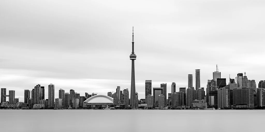
Architecture translates beautifully to black and white. Buildings are defined by geometric shapes, lines, and the play of light on surfaces, all elements that monochrome emphasizes. Modern architecture with clean lines and smooth surfaces produces graphic, minimalist black and white images. Historical architecture with ornate details reveals textures and patterns that color can overwhelm.
Landscapes work in black and white when the scene has strong tonal contrast: dark mountains against bright skies, white snow against dark forests, dramatic storm clouds over textured terrain. Flat, evenly lit landscapes with subtle color differences tend to lose impact in monochrome. The landscapes that work best are those with clear separation between light and dark areas and interesting cloud formations or atmospheric effects.
Street photography and documentary work have an inherent affinity with black and white. The monochrome treatment distances the image slightly from reality, giving it a universal, timeless quality that pure documentation lacks. A street scene in black and white feels like a story or a moment of significance, while the same scene in color can feel like a snapshot.
Technical Approach to Black and White
Shooting
Always shoot in raw format when working in black and white. Raw files contain all the color channel data, which gives you far more control during conversion than a JPEG that has already been processed. Even if you use your camera’s monochrome mode for preview, make sure the camera is recording raw files underneath. The color information in the raw file is what allows you to make nuanced conversion decisions later.
Exposure in black and white shooting requires attention to the full tonal range. Aim to capture detail in both the highlights and the shadows. Overexposing to pure white or underexposing to pure black eliminates tonal information that cannot be recovered. Use the histogram to verify that you are capturing the full range of tones, from deep shadows to bright highlights, without clipping either end.
Conversion Methods
Simply desaturating an image to remove color is the most basic conversion method, but it gives you no control over how individual colors translate to gray tones. Better results come from using color channel mixing, where you control how much each color channel (red, green, blue) contributes to the final monochrome image. In Photoshop or Lightroom, the Black and White mix panel provides sliders for each color, letting you brighten or darken specific hues independently.
For example, darkening the blue channel makes skies appear darker and more dramatic. Brightening the red channel lightens skin tones in portraits. Darkening the green channel can make foliage appear richer and darker. These adjustments mimic the colored filters that film photographers used to control tonal rendering. A red filter on a film camera darkened blue skies dramatically. The digital equivalent is moving the blue slider leftward in the black and white mix panel.
Contrast and Tonal Range
Black and white images typically benefit from more contrast than color images. Without color to create visual separation, tonal contrast becomes the primary way to distinguish elements from each other. Increasing the contrast in a black and white image deepens the blacks and brightens the whites, creating a more dramatic, punchy look. However, too much contrast crushes shadow detail and blows out highlights, losing the subtle mid-tones that give a monochrome image its richness.
The tonal range from pure black to pure white is your entire palette. A well-crafted black and white image uses the full range, with true blacks, true whites, and a rich distribution of grays in between. Ansel Adams called this “previsualization,” imagining the final print’s tonal distribution before pressing the shutter. While digital post-processing gives us more flexibility than Adams had in the darkroom, the principle remains the same: think about your tonal range as a deliberate creative choice, not an afterthought.
Black and White Styles
High contrast black and white, with deep blacks and bright whites and few mid-tones, creates graphic, bold images with strong visual impact. This style works well for street photography, silhouettes, and dramatic portraits. Low contrast black and white, with a full range of soft grays, creates gentle, atmospheric images. This style suits foggy landscapes, quiet portraits, and any scene where you want to convey a contemplative or nostalgic mood.
High key black and white uses predominantly bright tones with few dark areas, creating a light, airy feeling. Low key black and white emphasizes dark tones with selective bright accents, creating moody, dramatic images. Both styles are intentional departures from full tonal range, and both can be highly effective when they match the subject and mood of the image.
When to Choose Black and White
Not every image benefits from black and white conversion. If color is a key element of the story (a vivid sunset, autumn foliage, a colorful market), removing it weakens the image. Choose black and white when the image’s strength lies in its structural elements: light and shadow, form and texture, line and shape. Choose it when the color in the scene is distracting or ugly. Choose it when you want to create a timeless, universal feeling that transcends a specific moment.
A useful test: if you can describe why the image works without mentioning any colors, it will likely work in black and white. “The light raking across the weathered face creates deep shadows that reveal character.” That description does not depend on color, so the image will translate well. “The bright red door stands out against the blue wall.” That description depends entirely on color, so removing it would eliminate the image’s primary appeal.
Black and white photography is not a fallback for images that do not work in color. It is a deliberate creative choice that, when applied to the right subjects with the right technique, produces images of extraordinary power and beauty. Learning to see and think in monochrome gives you access to a visual language that has defined some of the greatest photographs ever made. For a comprehensive starting guide to photography fundamentals, exploring the relationship between color and monochrome is an essential step in developing your creative eye.
Grain and Texture in Black and White
Film grain has been an integral part of the black and white aesthetic since the medium’s earliest days. In the digital era, many photographers deliberately add grain to their black and white images to evoke the look and feel of film. This is not merely nostalgia. Grain adds texture to smooth tonal gradations, preventing the sometimes sterile, overly clean look that digital captures can produce. A slight grain gives the image a physical, tangible quality that connects it to the long history of photographic prints.
When adding grain in post-processing, match the grain characteristics to the mood you want to create. Fine, subtle grain feels sophisticated and classical. Coarse, prominent grain feels raw, gritty, and immediate. The grain should complement the image’s content and emotional tone. A gentle portrait might benefit from fine grain, while a hard-edged street photograph might suit a grittier texture.
Dodging and Burning
Dodging (selectively lightening) and burning (selectively darkening) are darkroom techniques that remain essential in digital black and white work. Even Ansel Adams rarely printed a photograph without extensive dodging and burning to guide the viewer’s eye and create the tonal balance he envisioned. In digital post-processing, these techniques allow you to sculpt the light in your image, brightening areas you want to draw attention to and darkening areas you want to recede.
The key to effective dodging and burning is subtlety. The adjustments should be invisible. The viewer should feel drawn to certain areas without understanding why. Heavy-handed dodging and burning creates obvious halos and unnatural tonal transitions that undermine the image. Work with a soft, low-opacity brush and build up the effect gradually over multiple passes.
Printing Black and White
Black and white photographs reveal their full beauty in print. Screen displays, while convenient, emit light directly and cannot reproduce the deep, velvety blacks and luminous highlights of a fine print. A well-made black and white print on quality paper has a physical presence that no screen can match.
Paper choice affects the look of black and white prints dramatically. Glossy papers produce the deepest blacks and widest tonal range. Matte papers have a softer, more subtle tonal range with slightly lighter blacks. Fine art papers with textured surfaces add physical dimension and a handmade quality. Baryta papers, which have a traditional darkroom print surface, are particularly prized for their tonal richness and d-max (maximum density of black).
If you are serious about black and white photography, learning to print your work, whether through a dedicated photo printer or a professional lab, is a natural extension of the creative process. The print is where the photograph reaches its final form, where all the decisions about tonal range, contrast, and detail come together in a physical object that can be held, framed, and shared in a way that a digital file simply cannot replicate.
Long Exposure in Black and White
Long exposure techniques produce particularly striking results in black and white. Water rendered as smooth, misty surfaces. Moving clouds streaked across the sky. People blurred into ghostly traces. These effects, which can look gimmicky in color, take on an ethereal, timeless quality in monochrome. The reduction to pure tones removes the realistic color anchors that make long exposure effects look obviously manipulated, allowing them to feel more like natural, dreamlike interpretations of the scene.
Neutral density filters are essential for long exposure work in daylight. A 6-stop or 10-stop ND filter reduces the light entering the lens enough to allow multi-second or multi-minute exposures even in bright conditions. The resulting images, with their smooth water and streaked skies, translate beautifully to high-contrast black and white processing.
Developing Your Monochrome Eye
The best way to develop your black and white vision is to commit to shooting exclusively in monochrome for an extended period. Set your camera’s review mode to black and white (while still recording raw files), and spend a week or a month looking at the world purely in tones. You will begin to notice tonal relationships that color obscures. You will seek out light and shadow patterns rather than colorful subjects. You will start seeing texture, form, and contrast as primary elements rather than secondary ones.
Study the work of black and white masters, not just in photography but also in cinema. Films by directors like Ingmar Bergman, Federico Fellini, and more recently, Alfonso Cuaron demonstrate how monochrome can be used to create mood, direct attention, and tell stories through light alone. These visual lessons translate directly to still photography.
Black and white photography is not a limitation or a retro affectation. It is a distinct visual language with its own grammar and vocabulary. Learning to speak this language fluently adds depth and versatility to your photographic practice and connects you to a tradition that spans nearly two centuries of visual storytelling.
Whether you approach black and white as your primary medium or as an occasional creative choice, developing your monochrome skills will make you a better photographer overall. The discipline of seeing in tones teaches you to evaluate light, shadow, and composition with a clarity that carries over into your color work. Many of the greatest color photographers began as black and white practitioners, and the structural awareness they developed in monochrome informed everything they created afterward.